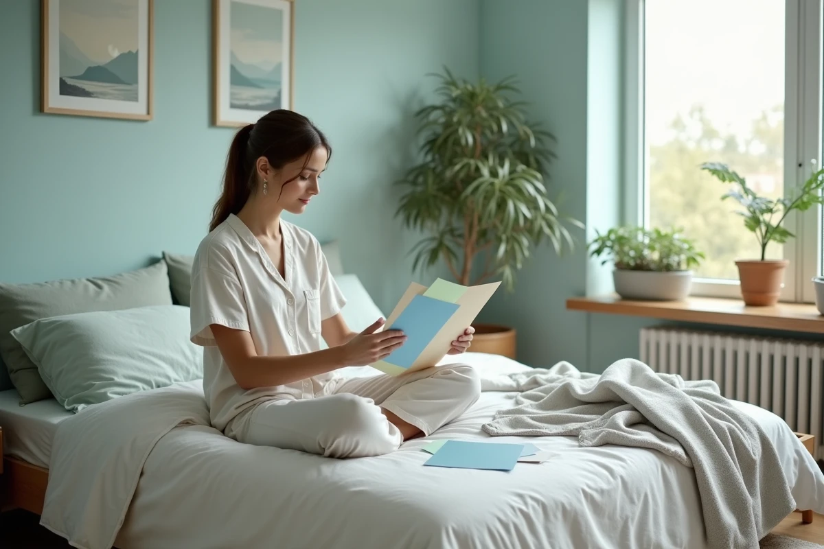
Some shades, deemed calming by most experts, can paradoxically disrupt sleep in certain individuals who are hypersensitive to colors. Conversely, hues known for their stimulating properties sometimes have no notable impact on the quality of nighttime rest.
The influence of colors on sleep is not governed by a universal rule; it depends on physiological, psychological, and even cultural factors. Recommendations vary according to research and individual sensitivities, necessitating a distinction between general trends and specific needs.
Why does the color of the bedroom influence sleep quality?
Considering the color of a bedroom is not just a matter of taste or decoration. It’s about deciding the atmosphere, modulating the surrounding stress, and sometimes unknowingly affecting the very quality of one’s sleep. Advances in neuroscience and color psychology reveal that certain shades trigger serenity, while others send wake-up signals to our brain. Color acts in the background, influencing our relaxation and our ability to let go as night falls.
This is why color choices for bedding, paint, or wallpaper can make all the difference. Dark blue and soft green, for example, soothe inner tension, help disconnect, and provide the room with a comforting atmosphere. Even pastel colors, long reserved for children’s rooms, offer adults a true refuge from the turmoil of daily life.
If one aspires to a bedroom that exudes tranquility, it’s better to opt for natural shades, raw materials, and a decor without visual overload. This way, the space becomes a cocoon that aids in falling asleep. To go further or find inspiration, calming colors according to Murmures Déco provide a detailed overview of shades and combinations favorable to rest. With such guidelines, transforming one’s bedroom into a sanctuary of calm becomes an achievable goal.
Calming palette: which shades to favor for an adult bedroom conducive to rest?
The choice of colors in an adult bedroom is not limited to following the latest trends. It’s a lever to promote sleep and create a genuine sense of well-being. At the top of the list is blue: universally recognized for its ability to reduce stress and create an atmosphere conducive to relaxation, whether deep or in pastel form.
Another significant ally is green. Drawing inspiration from nature, it radiates a discreet yet remarkably effective serenity (a simple sage or olive tone is often enough to transform the atmosphere). Light purple accompanies the transition to sleep, slowing the pace and inviting meditation.
On the side of neutrals: bright white, gray, taupe, and beige should be favored to extend the space, enhance light, and establish a peaceful ambiance. Pastel pink brings its tenderness, while terracotta offers a reassuring envelope without excessive decoration.
Here are some tips for creating a harmony that supports nighttime rest:
- Stick to a trio of soft colors to maintain the visual balance of the room.
- Reserve vibrant hues (like red, bright orange, or vivid yellow) for dynamic spaces, lest you sabotage the desire to sleep.
- Black, used in touches, structures the space without diminishing its softness.
The tradition of Feng Shui also carries this message: balance, simplicity, natural shades to enhance inner calm. Adapting one’s palette means choosing subtlety, harmony, and gradually transforming the bedroom into a true center for rejuvenation.
Color therapy and decor tips: how to adapt colors to your space for better sleep
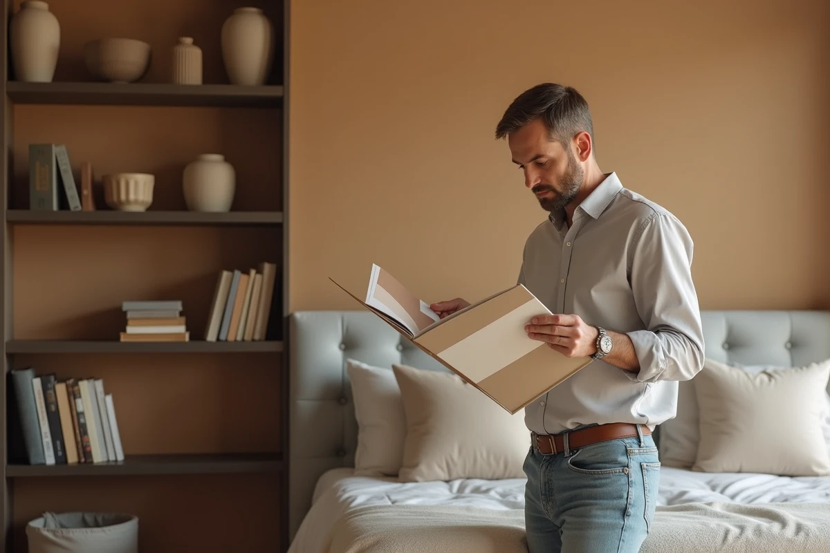
With color therapy, color becomes a well-being tool in its own right, finding its place even in the bedroom. Before repainting the walls, one must consider the light: exposure, natural light sources, and the size of openings guide the choice of shades. Light colors, white, beige, pearl gray, multiply brightness, enlarge the room, and create a sense of calm. In contrast, darker tones enhance the cocooning effect, enclosing the space to help disconnect from the outside.
A often overlooked tip: coordinate the furniture with the walls. A light wood bed placed against a very pale blue or soft green creates immediate harmony. Natural materials, linen, cotton, wool, amplify the feeling of comfort. The bedding, carefully coordinated, unifies the whole for a complete sensory experience.
To energize the space without overwhelming it, one can opt for light wallpapers or vary textile textures. A few well-chosen objects, a wooden basket, a rattan lamp, a graphic headboard, inject an authentic note, contributing to true relaxation. When the softness of colors combines with the nobility of materials, the night gains a silent ally.
The arrangement of children’s and babies’ rooms also benefits from this balance: pastel or neutral shades preserve peace and instinctively create a protective environment. Nothing is trivial in the composition of a room conducive to rest. The details make the difference, transforming this ordinary place into an essential space for recharging batteries. Leaving the door ajar to color is to give sleep every chance.